When Inflation Outpaces Real Income
January 18, 2023
There’s a trove of rich economic data on the Federal Reserve Economic Data (FRED) website, including data on inflation and real wages over time.
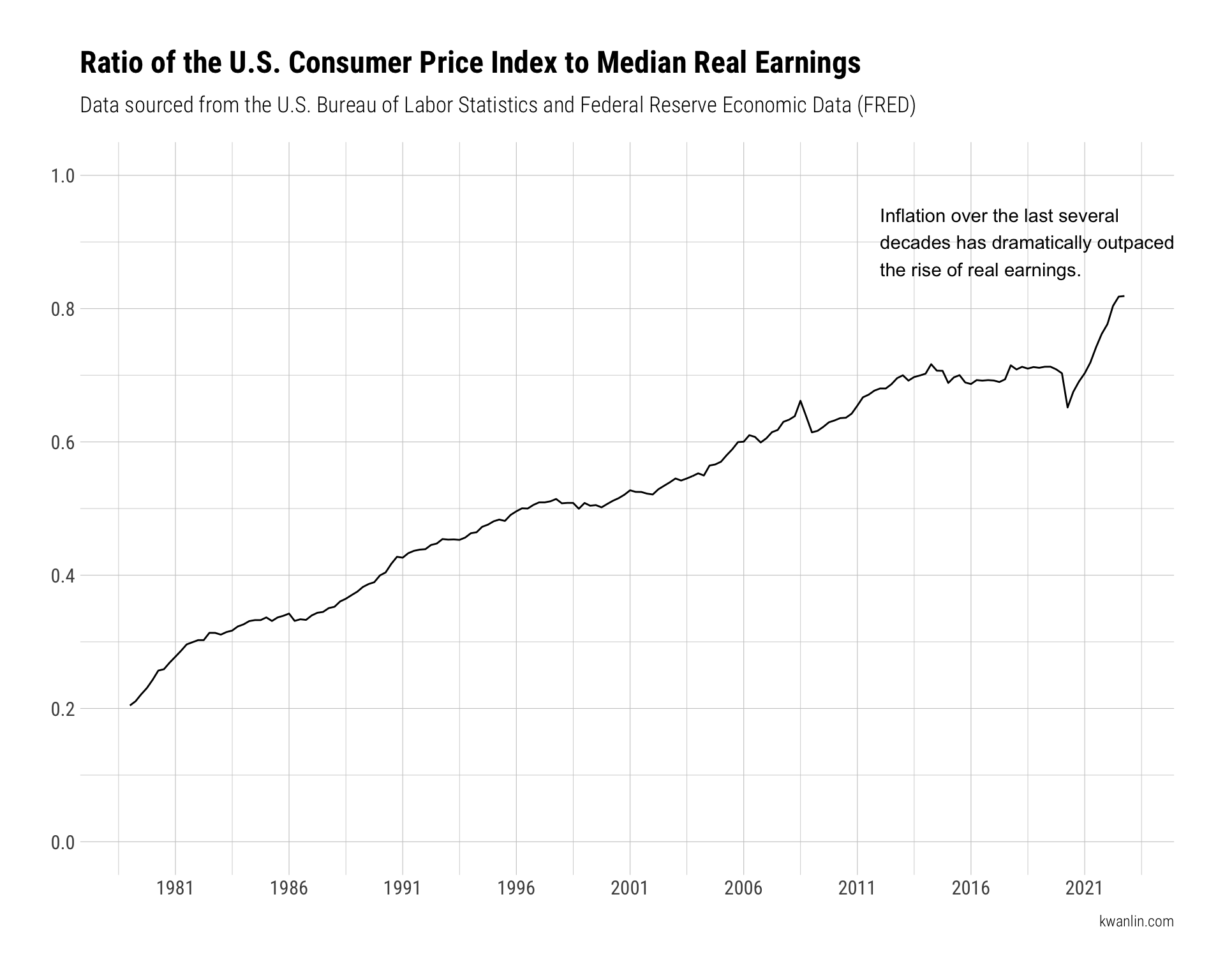
How well has real wages kept pace with inflation – the cost of living – over time? Let’s turn to our good old friend Data Visualization to get a grasp on the matter.
As always, first, let’s load up some essential packages.
library(tidyverse)
library(ggplot2)
library(hrbrthemes)
Then, let’s grab some data, including:
Note: This data was downloaded on January 26, 2023.
dat_cpi <- read_csv(here::here("content/gallery/us-inflation/data/CPIAUCSL.csv"))

head(dat_cpi)
## # A tibble: 6 × 2
##   DATE       CPIAUCSL
##   <date>        <dbl>
## 1 1947-01-01     21.5
## 2 1947-02-01     21.6
## 3 1947-03-01     22
## 4 1947-04-01     22
## 5 1947-05-01     22.0
## 6 1947-06-01     22.1
dat_wages <- read_csv(here::here("content/gallery/us-inflation/data/LES1252881600Q.csv"))

head(dat_wages)
## # A tibble: 6 × 2
##   DATE       LES1252881600Q
##   <date>              <dbl>
## 1 1979-01-01            335
## 2 1979-04-01            335
## 3 1979-07-01            330
## 4 1979-10-01            326
## 5 1980-01-01            321
## 6 1980-04-01            315
Now, we’ll join the two together. Note that the real wage data doesn’t go as far back and isn’t represented as regularly as CPI data. We’ll address the data disparity with a filter (though a one-sided join would work just as well).
Once we have a unified dataframe with both pieces of data, we can generate a ratio calculation of the CPI divided by the real wage metric. There’s a whole backstory to how each of those metrics are calculated. For now, we’re mostly interested in the direction of the ratio over time.
If the ratio goes up, that means the cost of goods is increasing at a rate greater than the real wage.
dat_join <- full_join(dat_cpi, dat_wages, by = c("DATE")) %>%
  filter(!is.na(LES1252881600Q)) %>%
  mutate(ratio = CPIAUCSL / LES1252881600Q)

head(dat_join)
## # A tibble: 6 × 4
##   DATE       CPIAUCSL LES1252881600Q ratio
##   <date>        <dbl>          <dbl> <dbl>
## 1 1979-01-01     68.5            335 0.204
## 2 1979-04-01     70.6            335 0.211
## 3 1979-07-01     73              330 0.221
## 4 1979-10-01     75.2            326 0.231
## 5 1980-01-01     78              321 0.243
## 6 1980-04-01     80.9            315 0.257
Now that we have the data prepared, let’s drop it into a visualization.
dat_join %>%
  ggplot(aes(x = DATE, y = ratio)) +
  geom_line() +
  theme_ipsum_rc() +
  scale_x_date(date_labels = "%Y", breaks = "5 years") +
  scale_y_continuous(limits = c(0,1), breaks = seq(0,1,.2)) +
  labs(
    title = "Ratio of the U.S. Consumer Price Index to Median Real Earnings",
    subtitle = "Data sourced from the U.S. Bureau of Labor Statistics and Federal Reserve Economic Data (FRED)",
    x = NULL,
    y = NULL,
    caption = "kwanlin.com"
  ) +
  annotate(
    "text",
    x = as.Date("2012-01-01"),
    y = .9,
    label = "Inflation over the last several\ndecades has dramatically outpaced\nthe rise of real earnings.",
    hjust = 0
  )

Unfortunately, it’s not a pretty picture.