Price to Rent Ratio for Multiple Regions
March 7, 2022
Overview #
A common metric that real estate investors rely on to determine where to invest is the price to rent ratio.
This is a fairly simple formula: \(Price to Rent Ratio = \frac{Median Home Price}{Median Annual Rent}\).
A high price to rent ratio suggests that the demand for rentals is high within a given market.
The general idea is that if real estate prices within a given area are extremely high relative to rent, renting will be far more financially accessible than buying, which would drive up the demand for rentals.
Real estate investors might want a consolidated view of price to rent ratios for multiple areas. Here we’ll put together just that view using publicly available data.
Data #
Zillow makes a lot of useful data available on their Housing Data page. Some of that data can be used to calculate the price to rent ratio for many regions over multiple periods.
The two pieces of data we’re looking at in this case are:
-
Zillow Home Value Index (ZHVI), which represents typical home values in the medium range
-
Zillow Observed Rent Index (ZORI), which represents typical monthly rents
It’s a lot of data. I imagine it’d be a pain to mash the two data sources together using something like a spreadsheet. Fortunately, it’s a breeze with a little bit of R programming.
The ZHVI includes region identifiers, region names, region types, state, and separate monthly columns going back to the year 2000.
Here’s a trimmed down preview of the ZHVI dataset.
| RegionID | SizeRank | RegionName | RegionType | StateName | 2000-01-31 | 2000-02-29 | 2000-03-31 |
|---|---|---|---|---|---|---|---|
| 102001 | 0 | United States | Country | NA | 127215 | 127559 | 127921 |
| 394913 | 1 | New York, NY | Msa | NY | 223454 | 224790 | 225991 |
| 753899 | 2 | Los Angeles-Long Beach-Anaheim, CA | Msa | CA | 231141 | 231946 | 233179 |
| 394463 | 3 | Chicago, IL | Msa | IL | 169006 | 169405 | 169921 |
| 394514 | 4 | Dallas-Fort Worth, TX | Msa | TX | 130305 | 130410 | 130496 |
| 394974 | 5 | Philadelphia, PA | Msa | PA | 129210 | 129643 | 129903 |
| 394692 | 6 | Houston, TX | Msa | TX | 125299 | 125376 | 125258 |
| 395209 | 7 | Washington, DC | Msa | DC | 191888 | 192133 | 192510 |
Overall, there are 907 rows and 270 columns.
The ZORI dataset includes region identifiers, region names, and monthly columns going back to 2014. There are 102 rows and 100 columns.
| RegionID | RegionName | SizeRank | 2014-01 | 2014-02 | 2014-03 | 2014-04 | 2014-05 |
|---|---|---|---|---|---|---|---|
| 102001 | United States | 0 | 1264 | 1274 | 1275 | 1282 | 1294 |
| 394913 | New York, NY | 1 | 2208 | 2236 | 2243 | 2249 | 2280 |
| 753899 | Los Angeles-Long Beach-Anaheim, CA | 2 | 1797 | 1826 | 1814 | 1822 | 1845 |
| 394463 | Chicago, IL | 3 | 1403 | 1415 | 1417 | 1421 | 1436 |
| 394514 | Dallas-Fort Worth, TX | 4 | 1097 | 1123 | 1128 | 1144 | 1139 |
| 394974 | Philadelphia, PA | 5 | 1309 | 1276 | 1296 | 1300 | 1308 |
| 394692 | Houston, TX | 6 | 1142 | 1171 | 1159 | 1167 | 1191 |
| 395209 | Washington, DC | 7 | 1737 | 1776 | 1764 | 1764 | 1776 |
A few things I noticed when inspecting the data:
-
The
RegionIDfield seems like a unique identifier common across both datasets, which is a good thing – it should make joining the two datasets fairly easy. -
The months are represented differently. In the ZHVI data, the months are formatted as year-month-date, while the ZORI data is formatted as year-month. That needs to be standardized before the data can be joined, assuming we want to join the data by month and region.
-
The data in both cases is extremely wide. This is a bit clunky to work with and warrants some data restructuring.
The ZHVI dataset once restructured is much bigger with 240,090 rows and goes back further in time. In contrast, the ZORI dataset only has 9,894 rows. We’ll treat the ZHVI dataset as the main one, and enrich that dataset with the ZORI dataset.
After all the data manipulation and joining, we now have price to rent ratios calculated going back to January 2014. The latest period we have complete data for is January 2022.
Note that all region names we’re using here are based on the naming convention used in the Zillow source data.
Latest Period #
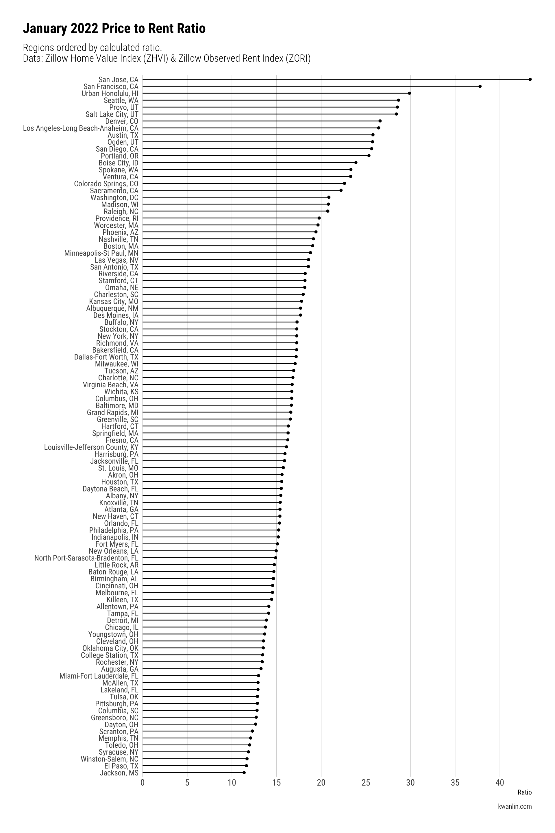
Here’s what the price to rent ratio looks like for multiple regions in the latest available period of Zillow data.
We’ve ordered the regions by descending ratio order.
## Warning: Using the `size` aesthetic with geom_segment was deprecated in ggplot2 3.4.0.
## ℹ Please use the `linewidth` aesthetic instead.
## This warning is displayed once every 8 hours.
## Call `lifecycle::last_lifecycle_warnings()` to see where this warning was
## generated.

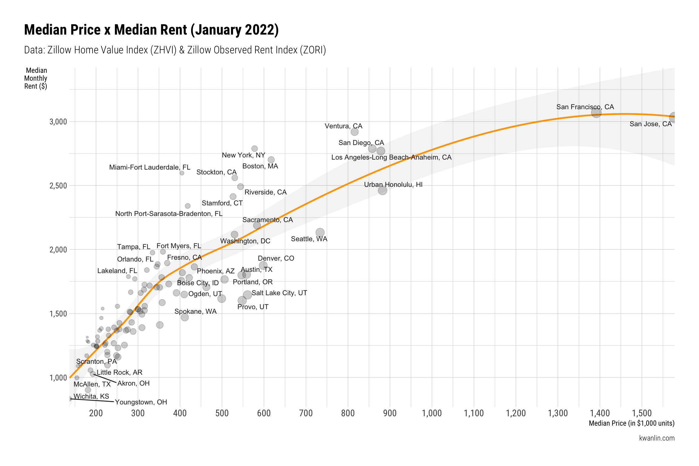
We can examine the underlying median price and median rent data more directly as a scatter plot, with some trending applied.
Some labels are dropped to avoid cluttering the plot too much.

The same underlying data, but with some additional details in tabular form (feel free the poke around. This table is interactive.):
According to Property Onion, a ratio over 21 is deemed high, between 16 and 20 is deemed medium, and 15 and below is low.
The medium range suggests that a region is fairly balanced between average home value and average monthly rent.
Over Time #
Here’s how the price to rent ratio has changed over the last several years for multiple regions. This gives us a sense of how the market has shifted.

Conclusion #
The price to rent ratio is an extreme simplification, but it’s a useful quick benchmark for real estate investing. It should really only be considered one piece of information in the larger analysis for real estate investing.
If you’re looking into real estate investing, I hope you find this information helpful.
If there’s any other way you’d like to see this data sliced or presented, feel free to shoot me a message or drop a comment below.
If you want to grab the data that I’ve cleaned up and joined, you can download it here.
Resources #
This section contains affiliate links.
There’s a lot more to consider when considering where to invest in real estate. A good resource to start with is the Long-Distance Real Estate Investing book by David Greene.
