Life Expectancy Across the World
February 25, 2023
I came across an interesting dataset on life expectancy for different countries on Worldometer, and thought that might make for some interesting visualizations.

First, I need to get ahold of the data, which is embedded in a web-page and isn’t in an immediately downloadable form. I’ll have to do some web-scraping. Fortunately, there’s rvest for that task.
The essential set of packages include:
library(tidyverse)
library(rvest)
library(hrbrthemes)
Data #
Let’s grab the data.
The process involves specifying the resource URL, then defining the elements on the page (in this case, I’m grabbing a distinct table), and then transforming it to a dataframe for use.
I’m also dumping the data to a .csv for good measure, in case the source page ever disappears or has a structural change that causes the web scraping logic to break.
I’m able to discern the element by using the browser’s inspector to zero in on the target.

url <- "https://www.worldometers.info/demographics/life-expectancy/"

table <- url %>%
  read_html() %>%
  html_elements("tbody") %>%
  html_table()

df <- as.data.frame(table) %>%
  rename(
    "index" = X1,
    "country" = X2,
    "life_expectancy" = X3,
    "life_expectancy_female" = X4,
    "life_expectancy_male" = X5
  )

# let's dump it out somewhere so we don't lose it
# write.csv(df, file = "df.csv")
Let’s take a look at that data now.
DT::datatable(df)
Lollipop #
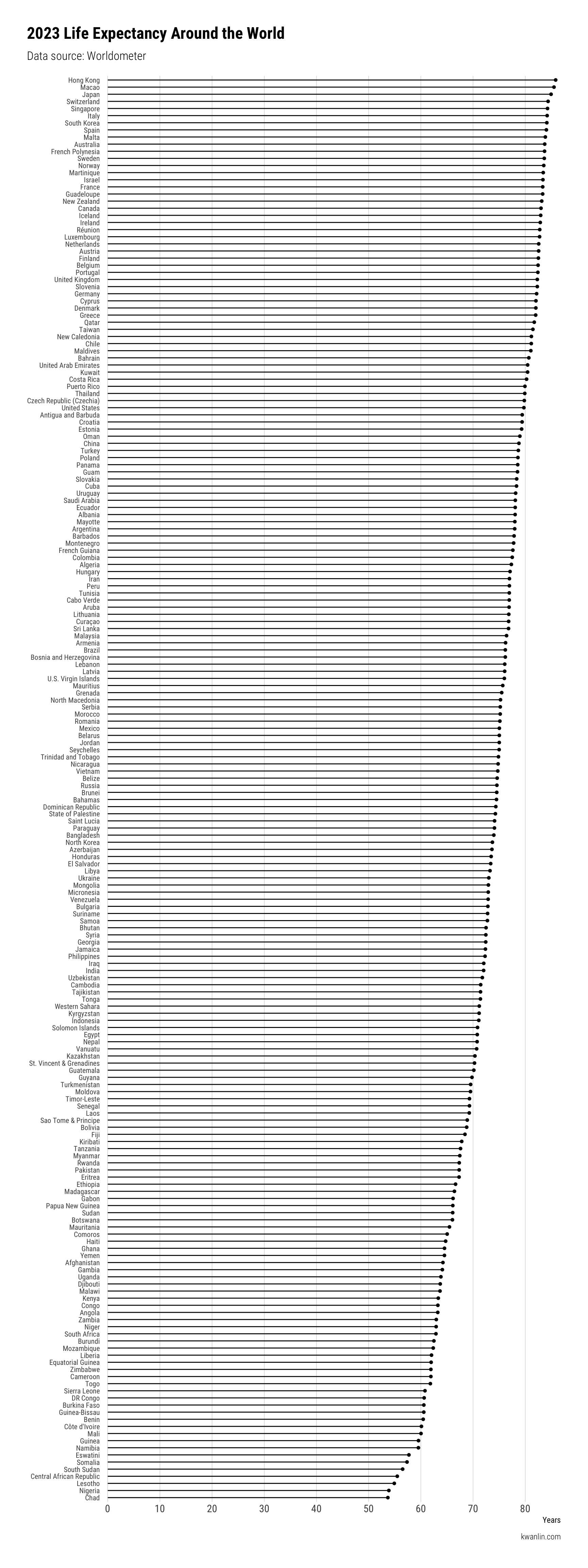
A simple way to look at this data is with a lollipop plot, really just a glorified bar plot with a point at the end.
df %>%
  distinct(country, .keep_all = TRUE) %>%  # raw data has duplicates for some reason
  ggplot(aes(y = life_expectancy, x = reorder(country, life_expectancy))) +
  ggalt::geom_lollipop() +
  scale_y_continuous(expand = c(0,1), breaks = seq(0,100,10)) +
  coord_flip() +
  theme_ipsum_rc(grid = "X") +
  theme(
    axis.text.y = element_text(size = 8),
    plot.title.position = "plot"
  ) +
  labs(
    title = "2023 Life Expectancy Around the World",
    subtitle = "Data source: Worldometer",
    y = "Years",
    x = NULL,
    caption = "kwanlin.com"
  )

And there it is – a very simple but clear and easily printable plot of life expectancy around the world, ordered sequentially by value.
World Tile Grids #
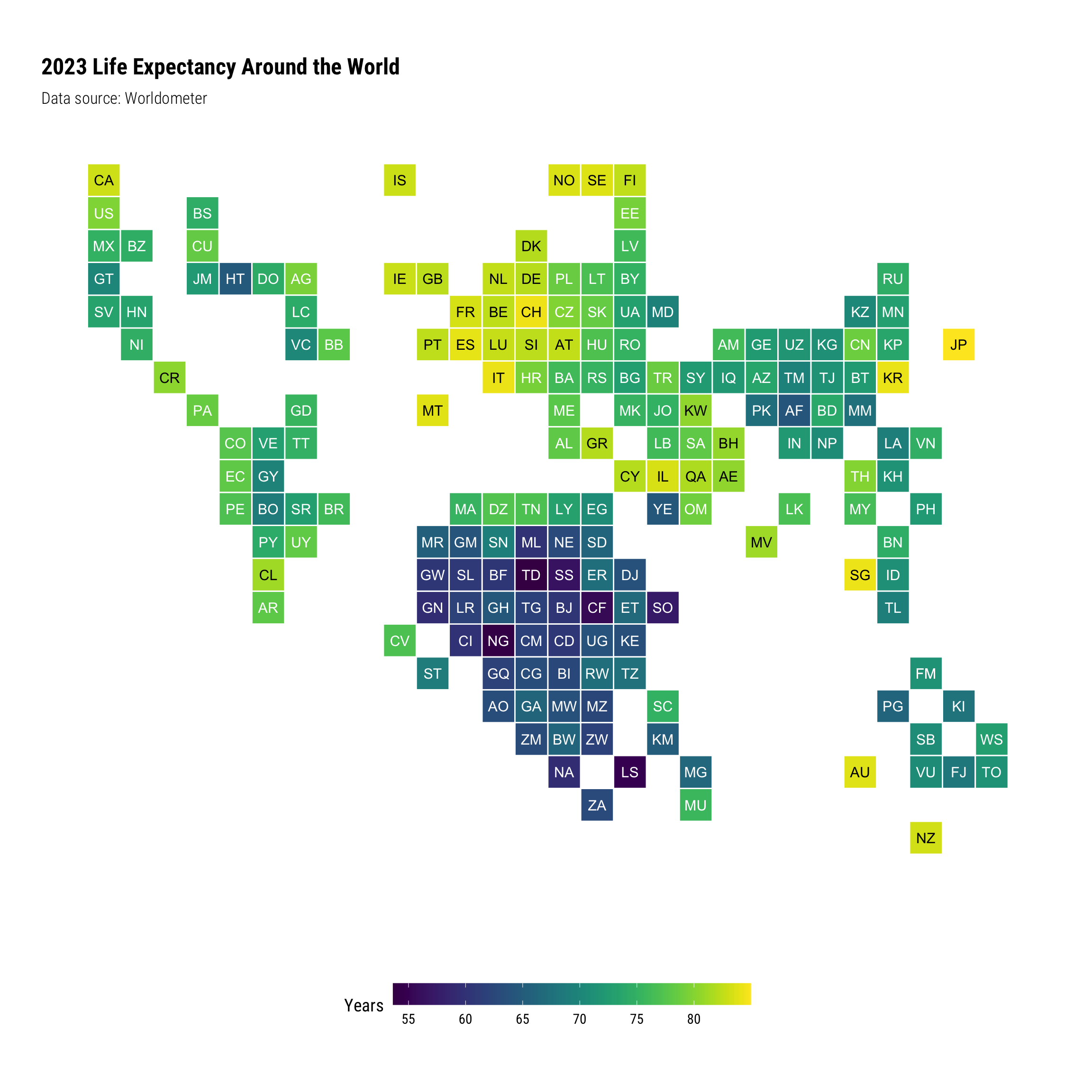
Another way to look at this information is using a world tile grid, which blends together elements of color gradation mapped to values, and approximate geographic location. It does away with geospatial projections, since in this case, we’re not really focusing on the geographic form of countries.
A world tile grid is something I consider visually interesting, but it falls short in a number of respects:
-
For this to work, you need to know the ISO 2-character country codes by heart. I imagine most people don’t memorize that.
-
The country naming convention strictly adheres to ISO-standards. Worldometer’s country names don’t map to ISO standards, which makes mapping data to position difficult. Example: Hong Kong. (On a separate matter, trying to get different organizations to conform to standardized country naming conventions is a whole separate can of worms to deal with).
In the code snippet below, there is a whole lot of country renaming to get the Worldometer data to conform to ISO standards so it can in turn be presented in a world tile grid. It’s tedious but necessary for this sort of plot.
# devtools::install_github("hrbrmstr/worldtilegrid")
library(worldtilegrid)

df %>%
  mutate(
    country = case_when(
      grepl("Antigua", country, ignore.case = TRUE) ~ "Antigua & Barbuda",
      grepl("Czech", country, ignore.case = TRUE) ~ "Czech Republic",
      grepl("Lucia", country, ignore.case = TRUE) ~ "St. Lucia",
      grepl("Vincent", country, ignore.case = TRUE) ~ "St. Vincent & the Grenadines",
      grepl("United Kingdom", country, ignore.case = TRUE) ~ "Great Britain and Northern Ireland",
      grepl("United States", country, ignore.case = TRUE) ~ "United States of America",
      grepl("DR Congo", country, ignore.case = TRUE) ~ "Congo (Democratic Republic of the)",
      grepl("Russia", country, ignore.case = TRUE) ~ "Russian Federation",
      grepl("Moldova", country, ignore.case = TRUE) ~ "Moldova (Republic of)",
      grepl("Trinidad", country, ignore.case = TRUE) ~ "Trinidad & Tobago",
      grepl("Sao Tome", country, ignore.case = TRUE) ~ "Sao Tome and Principe",
      grepl("Bosnia", country, ignore.case = TRUE) ~ "Bosnia & Herzegovina",
      grepl("Macedonia", country, ignore.case = TRUE) ~ "Macedonia",
      grepl("Laos", country, ignore.case = TRUE) ~ "Lao People's Democratic Republic",
      grepl("Vietnam", country, ignore.case = TRUE) ~ "Viet Nam",
      grepl("Brunei", country, ignore.case = TRUE) ~ "Brunei Darussalam",
      grepl("Micronesia", country, ignore.case = TRUE) ~ "Micronesia (Federated States of)",
      TRUE ~ country
    )
  ) %>%
  ggplot(aes(country = country, fill = life_expectancy)) +
  geom_wtg(border_size = .5, border_col = "white") +
  geom_text(
    aes(
      label = stat(alpha.2),
      # colour = I(ifelse(`Thing Val` < 500, "white", "black"))
      # color = I(ifelse('life_expectancy < 50, "white", "black"))
      color = I(ifelse(life_expectancy > 80, "black", "white"))
    ),
    # color = "white",
    stat = "wtg",
    size = 4
  ) +
  coord_equal() +
  viridis::scale_fill_viridis(na.value = "white") +
  labs(
    title = "2023 Life Expectancy Around the World",
    subtitle = "Data source: Worldometer",
    fill = "Years"
  ) +
  # guides(fill=guide_legend(title="Years")) +
  hrbrthemes::theme_ipsum_rc(grid="") +
  theme_enhance_wtg() +
  theme(
    legend.position = "bottom",
    legend.key.width = unit(2, "cm"),
    legend.text=element_text(size=11),
    legend.title=element_text(size=14)
  )

Dumbbell #
You might notice there are two entire columns of data we haven’t used yet – life expectancies by gender.
We shan’t let that data go to waste.
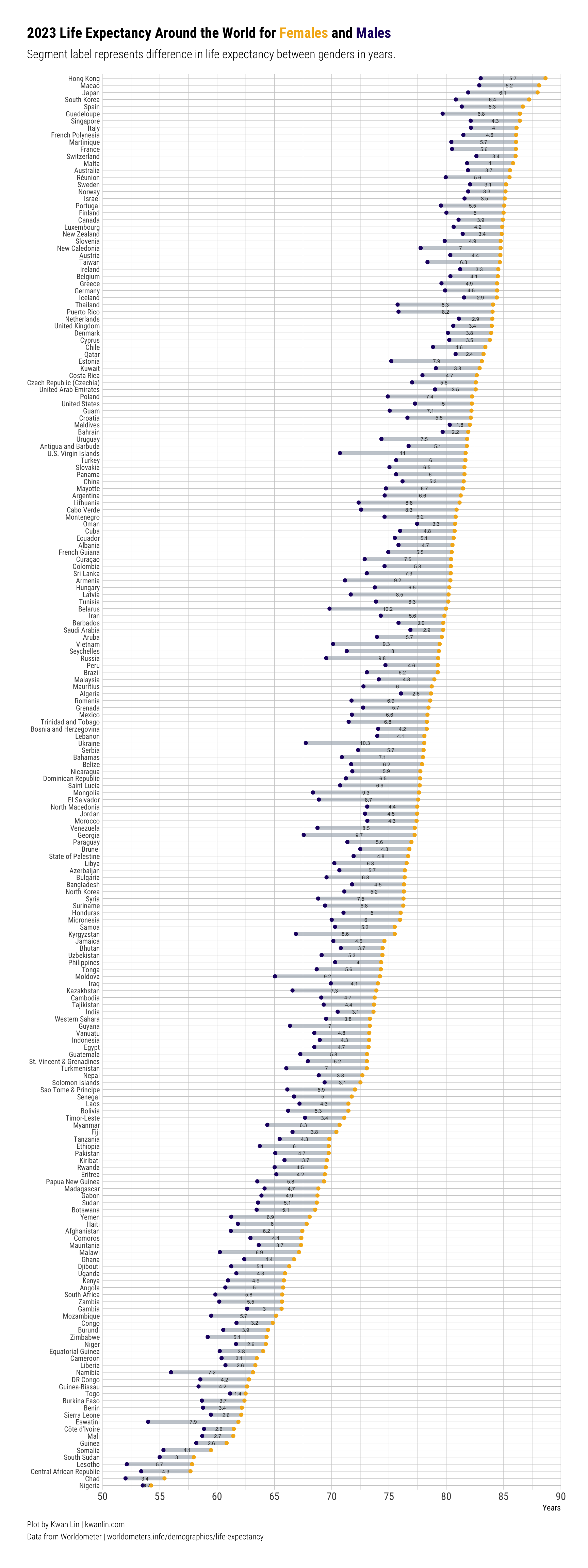
Let’s put together a dumbbell plot, ordered by female life expectancy (mainly because female populations uniformly live longer than male populations based on the data), while also showing the gap by country with male life expectancy.
df_long <- df %>%
  distinct(country, .keep_all = TRUE) %>%  # raw data has duplicates for some reason
  select(-c(index)) %>%
  mutate(diff = life_expectancy_female - life_expectancy_male) %>%
  pivot_longer(cols = c(life_expectancy_female, life_expectancy_male)) %>%
  mutate(name = gsub("life_expectancy_","", name)) %>%
  rename(gender = name, years = value)

# DT::datatable(df_long)
head(df_long)
## # A tibble: 6 × 5
##   country   life_expectancy  diff gender years
##   <chr>               <dbl> <dbl> <chr>  <dbl>
## 1 Hong Kong            85.8  5.66 female  88.7
## 2 Hong Kong            85.8  5.66 male    83
## 3 Macao                85.5  5.23 female  88.1
## 4 Macao                85.5  5.23 male    82.9
## 5 Japan                85.0  6.06 female  88.0
## 6 Japan                85.0  6.06 male    81.9
Now let’s separate them into two separate dataframes by gender, and also add a difference dataframe that we’ll use later for labeling purposes.
df_long
## # A tibble: 400 × 5
##    country     life_expectancy  diff gender years
##    <chr>                 <dbl> <dbl> <chr>  <dbl>
##  1 Hong Kong              85.8  5.66 female  88.7
##  2 Hong Kong              85.8  5.66 male    83
##  3 Macao                  85.5  5.23 female  88.1
##  4 Macao                  85.5  5.23 male    82.9
##  5 Japan                  85.0  6.06 female  88.0
##  6 Japan                  85.0  6.06 male    81.9
##  7 Switzerland            84.4  3.42 female  86.0
##  8 Switzerland            84.4  3.42 male    82.6
##  9 Singapore              84.3  4.29 female  86.4
## 10 Singapore              84.3  4.29 male    82.1
## # ℹ 390 more rows
male <- df_long %>% filter(gender == "male")
female <- df_long %>% filter(gender == "female")

df_diff <- df_long %>%
  filter(gender == "male") %>% # either gender choice works here, it just needs to be one of the two
  mutate(x_pos = years + diff/2) # this defines the horizontal position of the label

head(df_diff)
## # A tibble: 6 × 6
##   country     life_expectancy  diff gender years x_pos
##   <chr>                 <dbl> <dbl> <chr>  <dbl> <dbl>
## 1 Hong Kong              85.8  5.66 male    83    85.8
## 2 Macao                  85.5  5.23 male    82.9  85.5
## 3 Japan                  85.0  6.06 male    81.9  84.9
## 4 Switzerland            84.4  3.42 male    82.6  84.3
## 5 Singapore              84.3  4.29 male    82.1  84.3
## 6 Italy                  84.2  3.98 male    82.2  84.1
The data is at this point prepped for a basic dumbbell plot. Points will be used to represent each gender, and segments will be used to link the genders by country.
col_female = "#f4b41a"
col_male = "#210070"

ggplot(df_long) +
  # add the segments by country by gender
  geom_segment(
    data = male,
    aes(
      x = years,
      y = reorder(country, female$years),
      xend = female$years,
      yend = female$country
    ),
    color = "#aeb6bf",
    size = 2, # sized to match point size
    alpha = .7
  ) +
  # add the points by gender by country
  geom_point(
    aes(
      x = years,
      y = country,
      color = gender
    )
  ) +
  # add labels to the segments reflect difference
  geom_text(
    data = df_diff,
    aes(
      label = sprintf("%s", round(diff, digits = 1)),
      x = x_pos,
      y = country
    ),
    size = 2,
    color = "grey20"
  ) +
  scale_color_manual(values = c(female = col_female, male = col_male)) +
  scale_x_continuous(breaks = seq(0,100, 5), expand = c(0,0), limits = c(50,90)) +
  theme_ipsum_rc() +
  theme(
    axis.text.y = element_text(size = 8),
    plot.title.position = "plot",
    plot.caption.position = "plot",
    legend.position = "none",
    plot.title = ggtext::element_markdown(size = 16), # element_markdown allows for fancier formatting
    plot.caption = ggtext::element_markdown(lineheight = 1.5, hjust = 0)
  ) +
  labs(
    x = "Years",
    y = NULL,
    title = sprintf("2023 Life Expectancy Around the World for <span style = 'color: %s;'>**Females**</span> and <span style = 'color: %s;'>**Males**</span>", col_female, col_male),
    subtitle = "Segment label represents difference in life expectancy between genders in years.",
    caption = "Plot by Kwan Lin | __kwanlin.com__<br>Data from Worldometer | worldometers.info/demographics/life-expectancy"
  )

I’m still trying to figure out what are good color pairs to show discrete groups. I found this paired color guide that I’ve been experimenting with.
Update #
I floated the dumbbell plot around, and received some excellent constructive feedback. Some of the major points were: * There’s just too much going on * It’s difficult to line the dumbbells up to the countries * It’s hard to line values up with the x-axis labels because of how tall the plot is
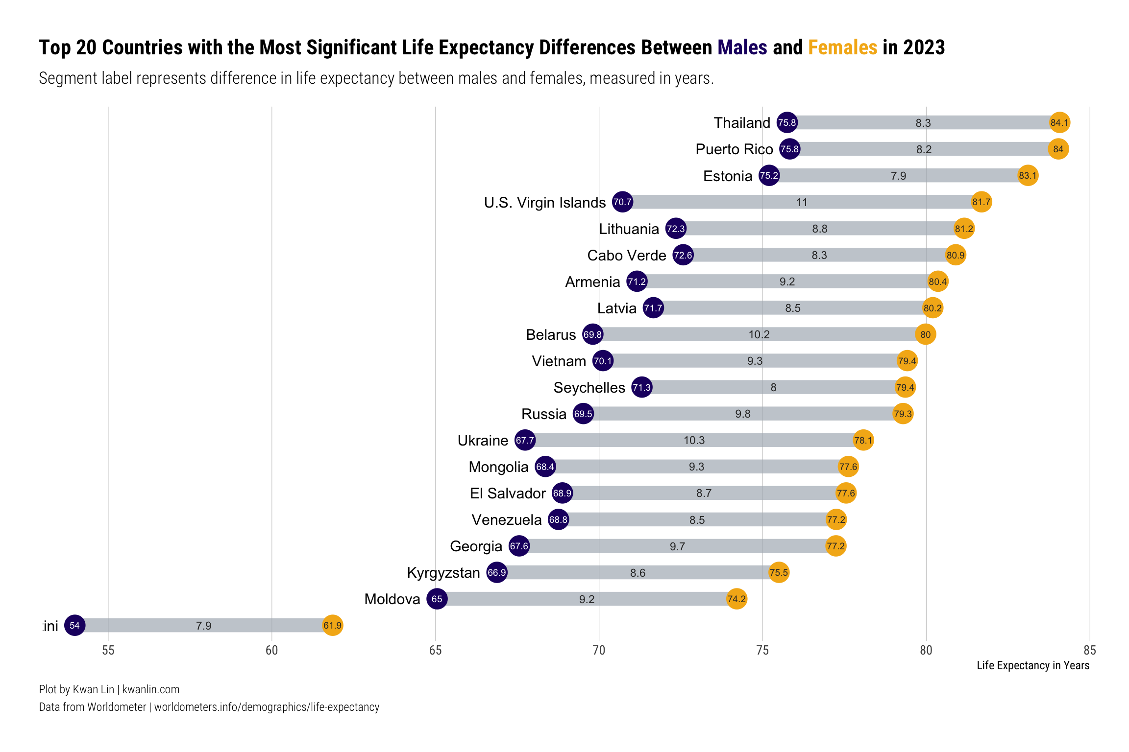
Here’s a revised dumbbell plot addressing much of that feedback. Rather than showing everything, it shows a subset of the overall data, with several changes to the labeling and proportions of elements.
First, let’s filter the data to cases where the life expectancy between genders differs by at least 5 years.
top_diff <- df_diff %>% arrange(desc(diff)) %>% head(20)

male_sub <- male %>% filter(country %in% top_diff$country)
female_sub <- female %>% filter(country %in% top_diff$country)
df_long_sub <- df_long %>% filter(country %in% top_diff$country)
ggplot(df_long_sub) +
  # add the segments by country by gender
  geom_segment(
    data = male_sub,
    aes(
      x = years,
      y = reorder(country, female_sub$years),
      xend = female_sub$years,
      yend = female_sub$country,
    ),
    color = "#aeb6bf",
    size = 5, # sized to match point size
    alpha = .7
  ) +
  # add the points by gender by country
  geom_point(
    aes(
      x = years,
      y = country,
      color = gender
    ),
    size = 7
  ) +
  # add labels to the segments reflect difference
  geom_text(
    data = top_diff,
    aes(
      label = sprintf("%s", round(diff, digits = 1)),
      x = x_pos,
      y = country
    ),
    size = 3,
    color = "grey20"
  ) +
  # move country labels to left of female points
  geom_text(
    data = male_sub,
    aes(
      label = sprintf("%s", country),
      x = years - .5,
      y = country
    ),
    size = 4,
    hjust = 1
  ) +
  # add year label to male points
  geom_text(
    data = male_sub,
    aes(
      label = sprintf("%s", round(years, digits = 1)),
      x = years,
      y = country
    ),
    color = "white",
    size = 2.5
  ) +
  # add year label to female points
  geom_text(
    data = female_sub,
    aes(
      label = sprintf("%s", round(years, digits = 1)),
      x = years,
      y = country
    ),
    color = "grey20",
    size = 2.5
  ) +
  scale_color_manual(values = c(female = col_female, male = col_male)) +
  scale_x_continuous(breaks = seq(0,100, 5), expand = c(0,0), limits = c(53,85)) +
  theme_ipsum_rc(grid ="X") +
  theme(
    axis.text.x = element_text(size = 10),
    axis.text.y = element_blank(),
    plot.title.position = "plot",
    plot.caption.position = "plot",
    legend.position = "none",
    plot.title = ggtext::element_markdown(size = 16), # element_markdown allows for fancier formatting
    plot.caption = ggtext::element_markdown(lineheight = 1.5, hjust = 0)
  ) +
  labs(
    x = "Life Expectancy in Years",
    y = NULL,
    title = sprintf("Top 20 Countries with the Most Significant Life Expectancy Differences Between <span style = 'color: %s;'>**Males**</span> and <span style = 'color: %s;'>**Females**</span> in 2023", col_male, col_female),
    subtitle = "Segment label represents difference in life expectancy between males and females, measured in years.",
    caption = "Plot by Kwan Lin | __kwanlin.com__<br>Data from Worldometer | worldometers.info/demographics/life-expectancy"
  )

Conclusion #
In this post, we went through a process of wrangling some embedded data from a website, and from that data, we were able to generate some very distinct views of that data.
After receiving many points of useful feedback, I went back and modified the dumbbell plot. If you’re following along, hopefully you find the process helpful.
If you have any questions or comments, feel free to drop me a note.