Overview #
A treemap is a way to show hierarchical data, where the shapes correspond to relative proportions.
Hierarchical data means there are layers to the stuff being examined, where specific things fit into broader buckets. There might be a major category, and within those categories, there might be minor categories.
In fact, there might be multiple layers of categorization.

Let’s say we’re talking about a kitchen pantry, and we want a count of the different types of items we have in the pantry. We want to show this information visually in a way that communications categories effectively.
In this kitchen pantry, we might find things like vegetables, fruits, and beverages. Within each of those major categories, we might find more specific items. Of all the vegetables we find, there might be more specific types of vegetables, like lettuce, broccoli, and onions.

Functionally, treemaps are very similar to circle packs.
Data #
To render a treemap, the data must include at least one categorical variable and one numerical variable.
There might be multiple categorical variables.
For instance:
| major | minor | count |
|---|---|---|
| vegetables | lettuce | 20 |
| vegetables | broccoli | 5 |
| vegetables | onion | 5 |
| fruits | apple | 15 |
| fruits | banana | 5 |
| beverages | soda | 4 |
| beverages | juice | 4 |
| beverages | water | 2 |
R #
There are packages available within the R ecosystem to generate treemaps.
treemapify #
The treemapify is one way to generate treemaps. treemapify builds upon ggplot2.
First, load up the package.
# install.packages("treemapify") # run this if the package hasn't already been installed
library(treemapify)
Let’s use the pantry example data here.
## # A tibble: 8 × 3
##   major      minor    count
##   <chr>      <chr>    <dbl>
## 1 vegetables lettuce     20
## 2 vegetables broccoli     5
## 3 vegetables onion        5
## 4 fruits     apple       15
## 5 fruits     banana       5
## 6 beverages  soda         4
## 7 beverages  juice        4
## 8 beverages  water        2
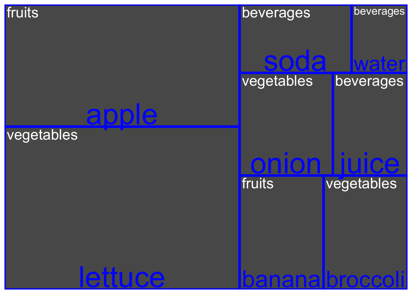
Fire up a treemap using the pantry data.
ggplot(
  pantry_dat,
  aes(
    area = count, # map the size to the count
    label = major,
    subgroup = minor
  )
) +
  geom_treemap() + # draw a treemap's main group
  geom_treemap_text(color = "white") +
  geom_treemap_subgroup_border(color = "blue") + # draw a treemap's subgroup
  geom_treemap_subgroup_text(color = "blue")

Well, that works, but that’s a fairly horrendous treemap.
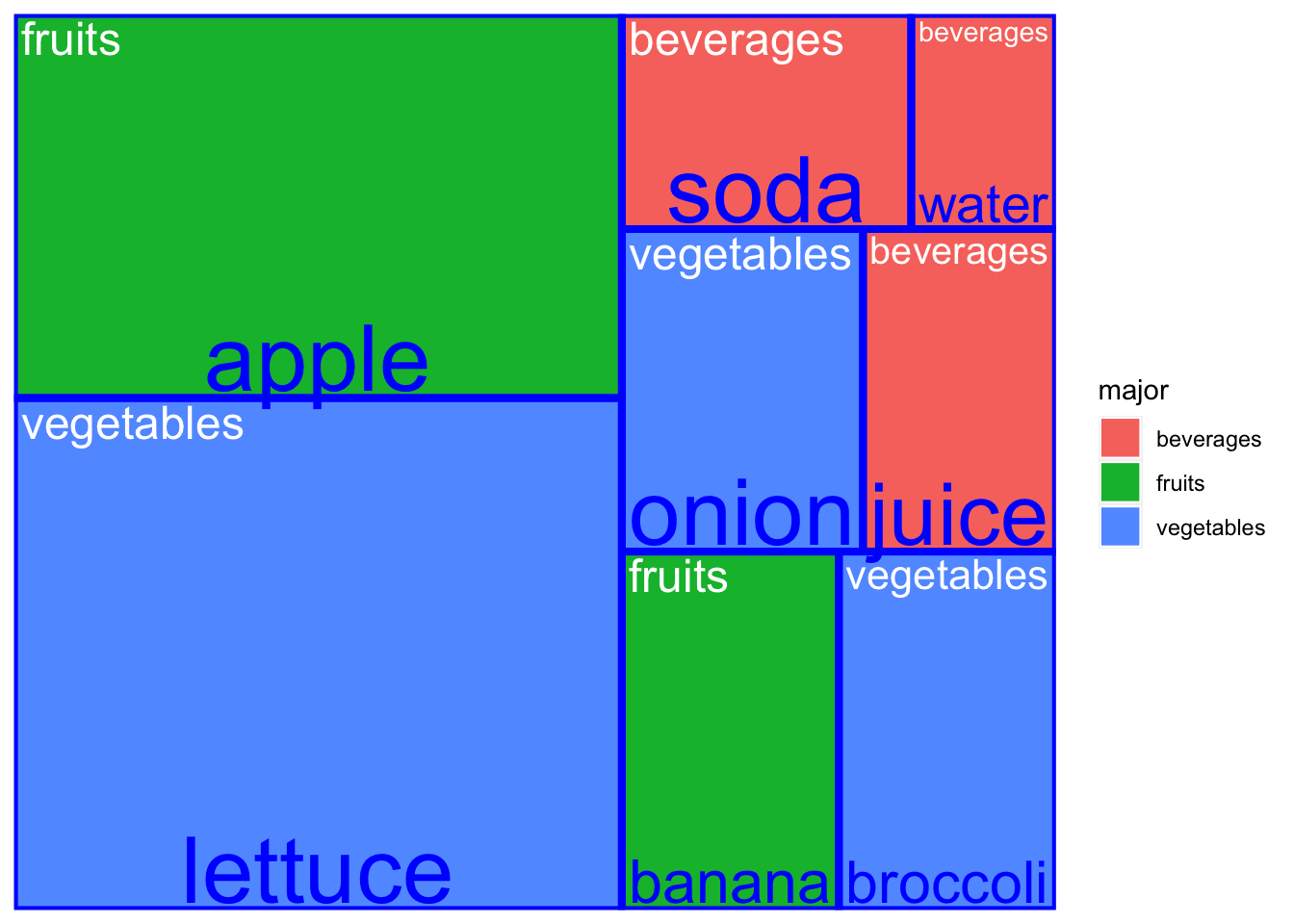
Let’s dress it up some.
ggplot(
  pantry_dat,
  aes(
    area = count, # map the size to the count
    label = major,
    subgroup = minor,
    fill = major # fill the shapes in by the major category
  )
) +
  geom_treemap() + # draw a treemap's main group
  geom_treemap_text(color = "white") +
  geom_treemap_subgroup_border(color = "blue") + # draw a treemap's subgroup
  geom_treemap_subgroup_text(color = "blue")

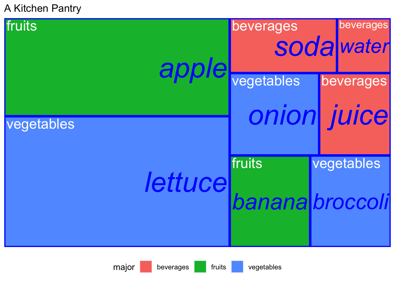
Better, but we can do better still.
ggplot(
  pantry_dat,
  aes(
    area = count, # map the size to the count
    label = major,
    subgroup = minor,
    fill = major # fill the shapes in by the major category
  )
) +
  geom_treemap() + # draw a treemap's main group
  geom_treemap_text(color = "white") +
  geom_treemap_subgroup_border(color = "blue") + # draw a treemap's subgroup
  geom_treemap_subgroup_text(color = "blue", fontface = "italic", place = "right") +
  theme(
    legend.position = "bottom"
  ) +
  labs(
    title = "A Kitchen Pantry"
  )

There’s still more room for improvement.
Resources #
- Here’s a super awesome post on treemaps in R: https://yjunechoe.github.io/posts/2020-06-30-treemap-with-ggplot/