Overview #
Well, this is potentially a controversial one: pie charts.
A pie chart is a circular plot that is divided into wedges, where the wedges reflect categories, and the size of the wedge corresponds to the proportion of the categories.

The major criticism of pie charts is that humans do a very poor job of visually comparing angular wedges. The whole point of data visualization is to convey dense data clearly, and pie charts fail at that, especially if there are too many categories. Something like a bar plot is far less ambiguous.
Pie charts - despite their flaws - are very prevalent and familiar. The popularity of pie charts can be considered one of their best features: they’re familiar to most people and require very little explanation. Pretty much anyone that looks at a pie chart gets it (or at least gets what it’s supposed to be conveying).
Data #
Pie charts require a categorical field and a numerical field.
An example datasset:
| category | value |
|---|---|
| A | 40 |
| B | 10 |
| C | 27 |
| D | 23 |
R #
Pie charts can be generated in R using base R or with ggplot2.
3d pie charts (which you really shouldn’t use because the additional visual effect adds no real data value) can be generated with the plotrix package.
Base R #
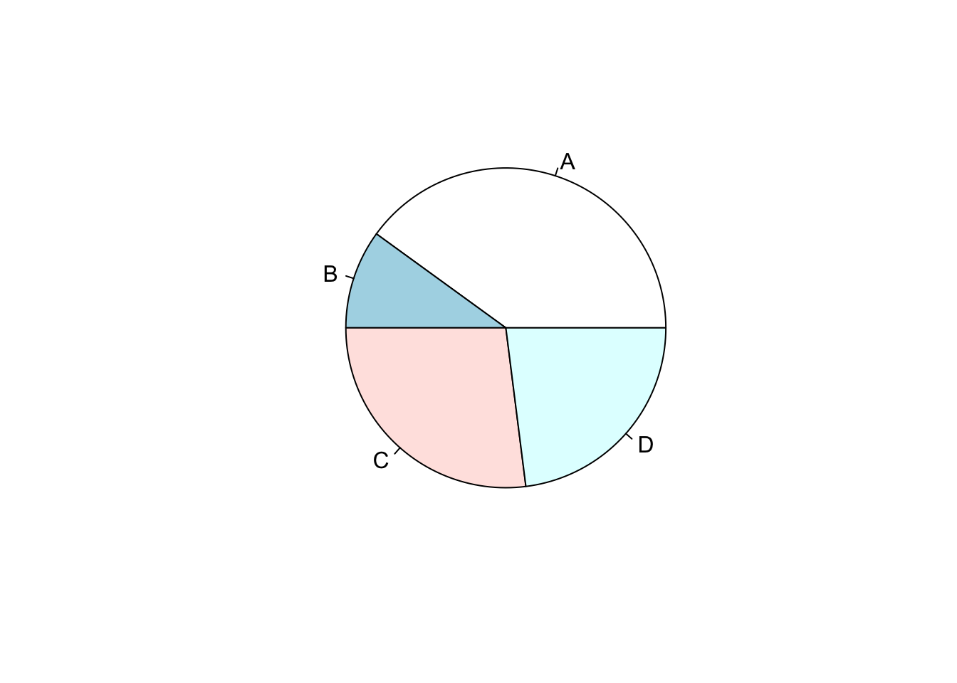
A super simple pie chart in base R can be generated using the pie() function. The inputs required are simply vectors, one categorical and one numerical.
Here’s the example dataset again:
dat_example
## # A tibble: 4 × 2
##   category value
##   <chr>    <dbl>
## 1 A           40
## 2 B           10
## 3 C           27
## 4 D           23
pie(
  x = dat_example$value,
  labels = dat_example$category
)
ggplot2 #
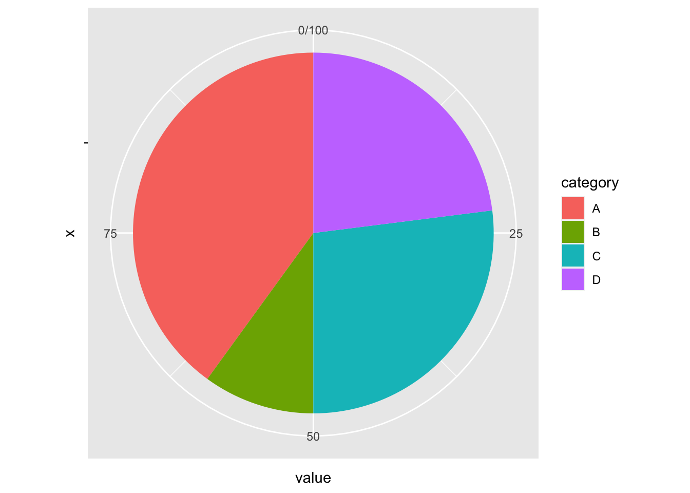
ggplot2 can be created using a combination of the geom_bar() function and the coord_polar() function.
This seems a bit strange, and it really is: in the world of ggplot2, a pie chart is really just a bar plot, but set in a circular polar coordinate system.
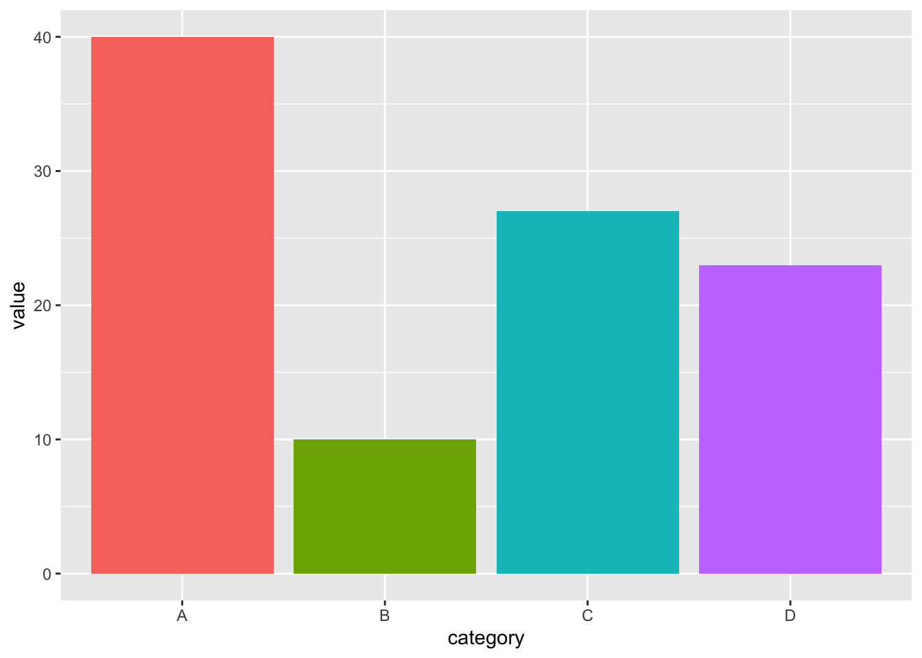
If this were a simple bar plot, it’d look like this:
ggplot(
  dat_example,
  aes(
    x = category,
    y = value,
    fill = category # color the bars based on the category
  )
) +
  geom_bar(stat = "identity") +
  theme(legend.position = "none") # remove the legend
And that gets turned into a pie chart with the removal of the x-axis mapping and the addition of a polar coordinate system, coord_polar(theta = "y). Since we’re removing the x-axis labels, it makes sense now to put the legend back.
ggplot(
  dat_example,
  aes(
    x = "",
    y = value,
    fill = category # color the bars based on the category
  )
) +
  geom_bar(stat = "identity") +
  coord_polar(theta = "y")
 This can be improved by removing extraneous labels, background, and other markers.
ggplot(
  dat_example,
  aes(
    x = "",
    y = value,
    fill = category # color the bars based on the category
  )
) +
  geom_bar(stat = "identity") +
  theme_void() +
  coord_polar(theta = "y")
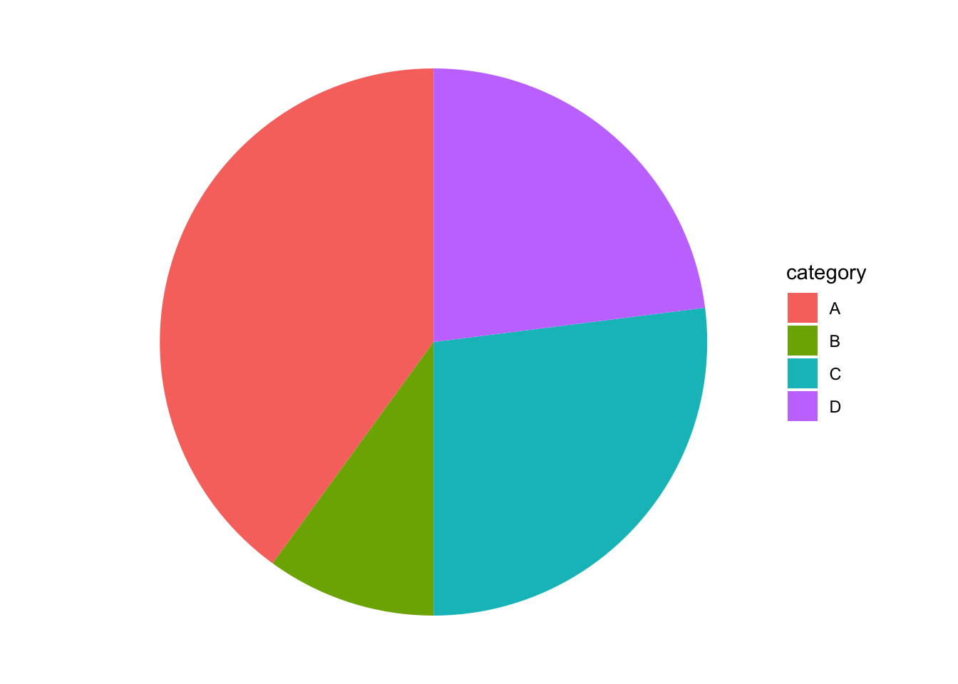
theme_void() is simply a bare theme with not much to it.
An unlabeled pie chart really isn’t terribly useful. geom_label() can be used to add some labels.
ggplot(
  dat_example,
  aes(
    x = "",
    y = value,
    fill = category # color the bars based on the category
  )
) +
  geom_bar(stat = "identity") +
  geom_text(aes(label = value),
            position = position_stack(vjust = 0.5)) +
  theme_void() +
  coord_polar(theta = "y")
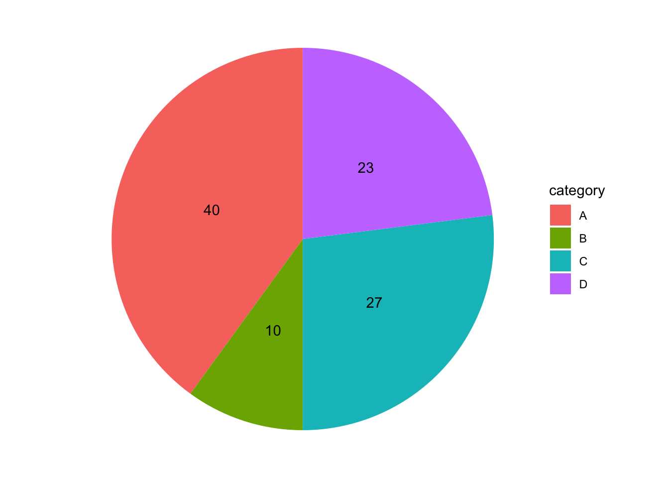
Let’s improve this some more with some dividing lines between the partitions and a title.
ggplot(
  dat_example,
  aes(
    x = "",
    y = value,
    fill = category # color the bars based on the category
  )
) +
  geom_bar(stat = "identity", color = "white") +
  geom_text(aes(label = value),
            position = position_stack(vjust = 0.5)) +
  theme_void() +
  coord_polar(theta = "y") +
  labs(
    title = "A Simple Pie Chart"
  )
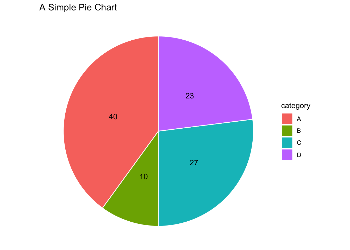
3d pie charts with plotrix #
if you insist, a 3-dimensional pie chart can be created using the pie3D() function from the plotrix package.
# install.packages("plotrix") run this if you haven't installed the package yet
library(plotrix)

pie3D(
  x = dat_example$value,
  labels = dat_example$category
)
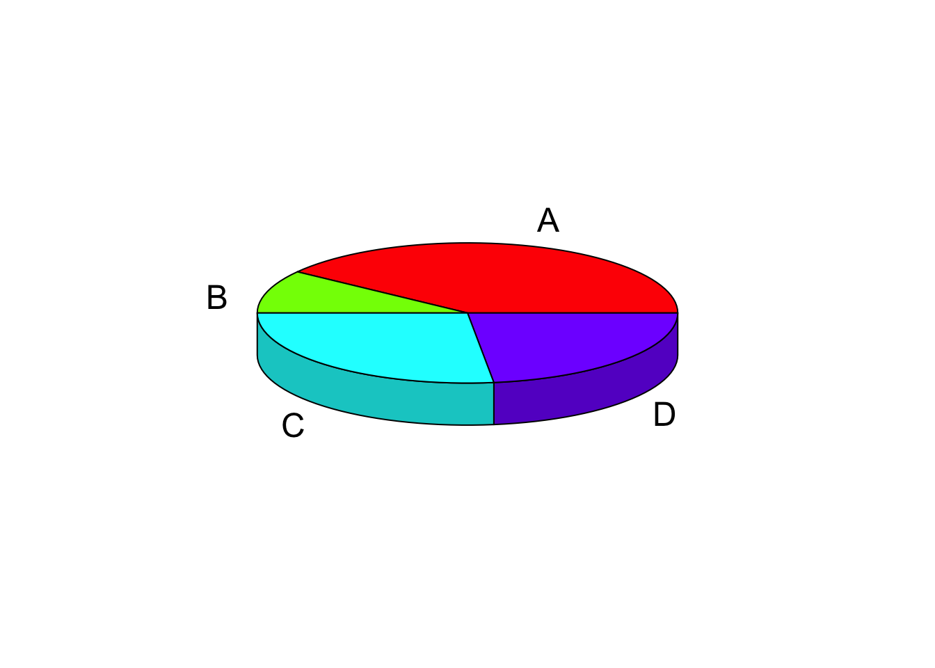
If you want to make it even fancier, you can separate out the wedges with the explode parameter.
pie3D(
  x = dat_example$value,
  labels = dat_example$category,
  explode = .1
)

But again, you really shouldn’t be using pie charts, especially 3-dimensional pie charts.
Resources #
Here are some good resources that talk about why pie charts are bad: